
Mood by Design: How Colour Shapes the Way You Feel at Home
When creating a home that feels both functional and deeply personal, one of the most influential - and often underestimated - elements is colour. Beyond its aesthetic appeal, colour has the ability to shape our emotional responses and influence how we interact with our surroundings.
At Inside Out Colour & Design, we work closely with clients across Sydney to ensure the colours in their homes are not only beautiful but also purposeful. Understanding the role colour plays in shaping mood is key to designing spaces that feel good to live in - not just look good in photos.

Colour plays a vital role in creating a home that feels both functional and emotionally connected. | Inside Out Colour & Design
Colour and Its Emotional Influence
While much of interior design focuses on spatial planning, finishes, and materials, colour silently sets the emotional tone of a home. Research in environmental psychology shows that our brains process colour almost instantly, with certain tones evoking calming responses while others stimulate alertness, focus, or even appetite.
Colour affects how large or intimate a space feels, how warm or cool it seems, and how comfortable people feel within it. This makes it a powerful design element - particularly in homes where spaces serve multiple functions and where emotional wellbeing is front of mind.
A Look at Colour and Mood
Here’s a broad overview of how colour is understood to influence mood in interior environments:
Blues
Often associated with calm and clarity, blue works well in bedrooms, bathrooms, or anywhere rest and reflection are priorities. Light blue can create an airy, coastal feel, while darker blues bring a sense of stability and sophistication.
Greens
Green is a colour of renewal and balance, frequently linked with nature. It’s ideal for living rooms, home offices, or areas where you want to encourage focus and serenity. Soft olives and sages are particularly adaptable in modern Australian interiors.

Blues and greens evoke calm and balance, making them ideal for restful, focused spaces. | Inside Out Colour & Design
Neutrals
Neutral tones - whites, greys, taupes, and beiges - are favoured for their versatility. They offer a calm, uncluttered base that pairs well with natural light and texture. Used strategically, they can create cohesion throughout open-plan homes.

Neutral tones create a calm, versatile base and unify open spaces. | Inside Out Colour & Design
Yellows
Bright and optimistic, yellow introduces warmth and cheer to a space. It’s often used in kitchens, entryways, or children’s spaces to encourage energy and sociability, although in large doses it can become overstimulating.
Reds and Oranges
These warm hues are known for their ability to stimulate and energise. While not often used as the dominant colour, they can be highly effective in smaller touches - feature walls, upholstery, or artwork - to add depth and vibrancy.
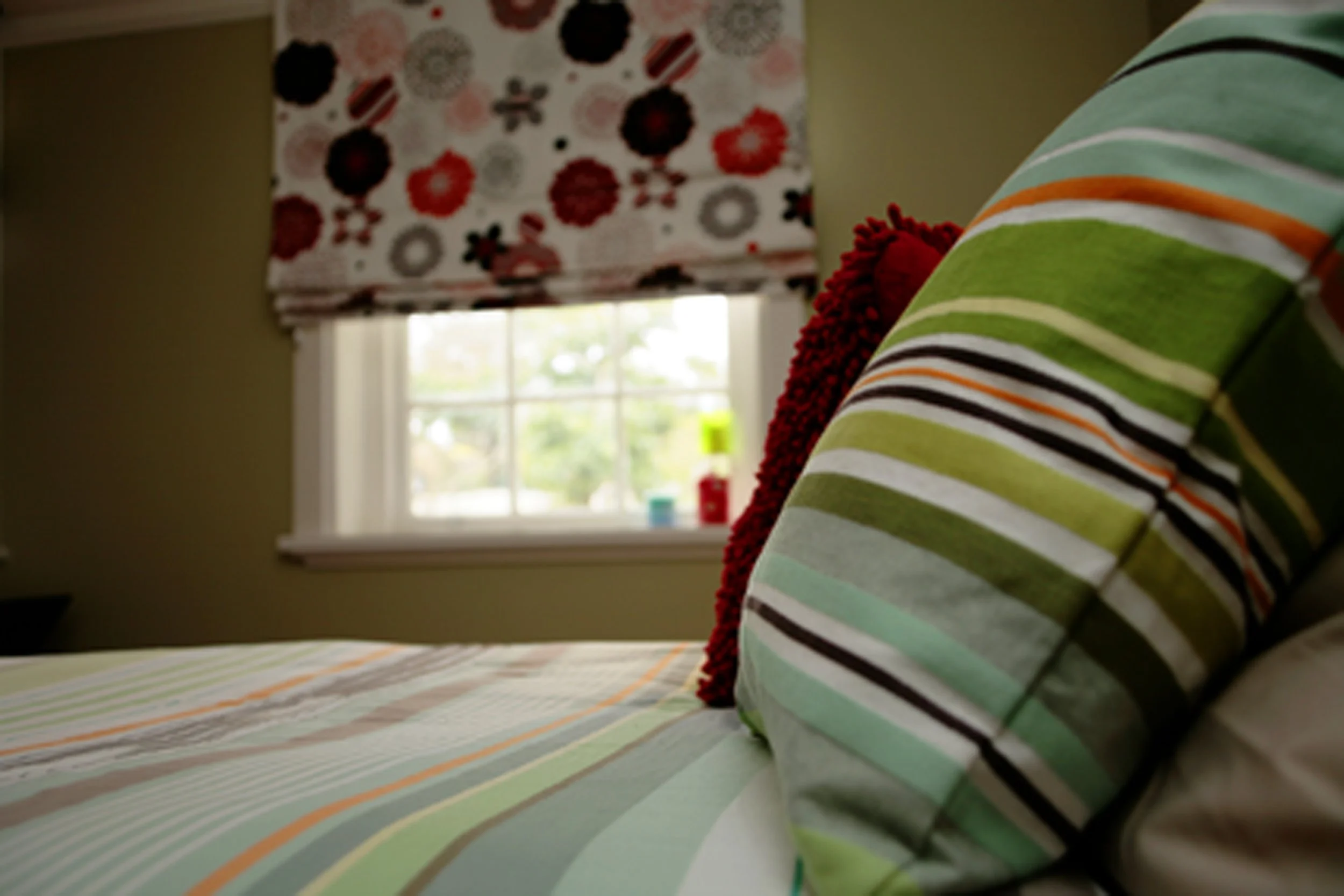
Yellows, reds and oranges energise a space and work well in small, vibrant accents. | Inside Out Colour & Design
Pinks and Mauves
Associated with softness and emotional warmth, these colours can create a nurturing or romantic atmosphere. They’re well suited to bedrooms or quiet corners and pair beautifully with timber and soft lighting.
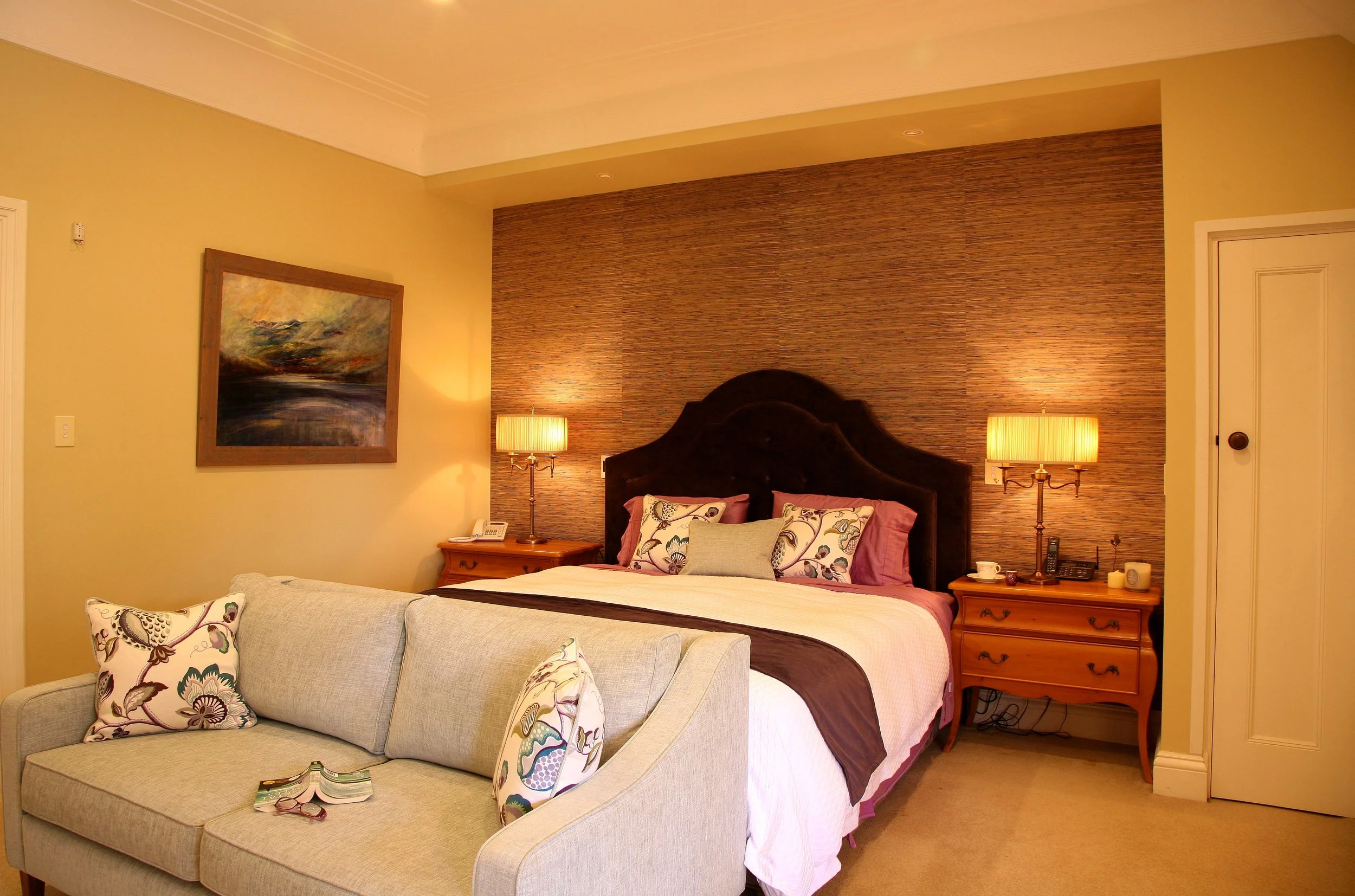
Pinks and mauves add warmth and softness, perfect for calm, intimate spaces. | Inside Out Colour & Design
Context Is Everything
The impact of a colour isn’t just about the colour itself - it’s about where, how, and under what conditions it’s used.
Natural light, orientation, and surrounding materials all influence how a colour appears in a room. For example, a white paint may feel crisp and bright in one home, and cold or flat in another, depending on lighting conditions and adjacent surfaces. Similarly, soft blues may feel restful in a north-facing bedroom but take on a chilly tone in a south-facing one.
This is where professional advice becomes invaluable. A colour that looks perfect in a showroom or on a Pinterest board may behave very differently in your own home.

A colour’s impact depends on context - light, orientation, and materials all affect how it looks and feels in a space. | Inside Out Colour & Design
Why Colour Consistency Matters
In modern homes - especially open-plan designs - colour consistency and flow are critical. Colours need to transition naturally from one space to another, supporting the intended function and mood of each room without abrupt shifts or visual disconnection.
A professional colour scheme ensures there’s a logical rhythm throughout the home. This doesn't mean every room needs to be the same colour, but rather that there's a deliberate harmony - whether through tone, undertone, or complementary accents.

A cohesive colour scheme creates a natural flow between spaces, supporting each room’s purpose and mood. | Inside Out Colour & Design
Balancing Personality with Timelessness
One of the challenges many homeowners face is the balance between current trends and enduring design. While a bold colour choice may feel exciting in the moment, it’s worth considering whether it will still feel right in five or ten years' time.
At Inside Out Colour & Design, we work closely with clients to understand their lifestyle, preferences, and long-term vision. A successful palette should reflect the personality of the people who live there, but also be considered enough to stand the test of time. We often introduce trends in small, flexible ways - through soft furnishings, artwork, or accents - while keeping walls and large pieces more timeless.

A well-chosen colour palette should reflect personal style while remaining timeless and suitable for long-term living. | Inside Out Colour & Design
Colour Consultations That Go Beyond the Surface
A professional colour consultation is more than choosing paint swatches. It involves a thorough understanding of your space, your natural and artificial lighting, existing finishes, and how each room is used.
It’s also about emotion. How do you want to feel when you step into your living room at the end of the day? What kind of mood should your bedroom evoke? These are the questions that guide a thoughtful, personalised approach.
Ready to find your perfect palette? Let’s chat about a colour consultation.