
Is Pantone’s Cloud Dancer Boring or Brilliant? Why this white works in Australian homes
Every December, somewhere between the last Christmas parties and the first slow summer days, the same question starts to pop up in conversations with clients, suppliers and fellow designers:
“So Jennifer, what do you think of Pantone’s Colour of the Year?”
For 2026, Pantone has certainly given us something to talk about. Instead of a bold blue or a juicy coral, the Pantone Colour of the Year 2026 is Cloud Dancer (Pantone 11-4201) – a soft, billowy white that they describe as a calming, lofty neutral and a kind of “blank canvas” for a noisy world.
On the surface it might look like “just white”, but there is a lot more going on – both culturally and in terms of decorating.
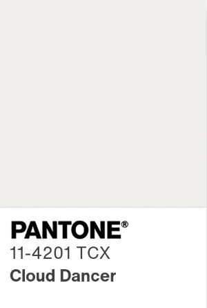
Cloud Dancer: Pantone’s soft, calming 2026 Colour of the Year | Pantone
Why we look to Pantone each year
Pantone is essentially the global language of colour. Their colour matching system lets printers, paint companies, product designers, fashion labels and graphic designers all speak in the same precise shade, so a particular red or green looks the same on a logo, a fabric swatch and a product box.
Since 1999, the Pantone Colour Institute has also chosen a Colour of the Year, based on research into fashion, interiors, art, technology, social media and the wider cultural mood. It is not a rule book, but it is a strong forecast. That one little chip often nudges what we see in:
fabric and wallpaper collections
furniture and homewares
branding and packaging
even paint colours, as local paint brands respond to the same trends
In Australia you might never ask your painter for “Pantone 11-4201”, but you will start to notice very similar whites and neutrals popping up in tiles, linen, stone, cabinetry finishes and styling imagery.
So for me, as an interior designer, Pantone’s choice is less about following a fad and more about understanding where the design world is heading and how that might filter into my client’s Sydney homes over the next few years.
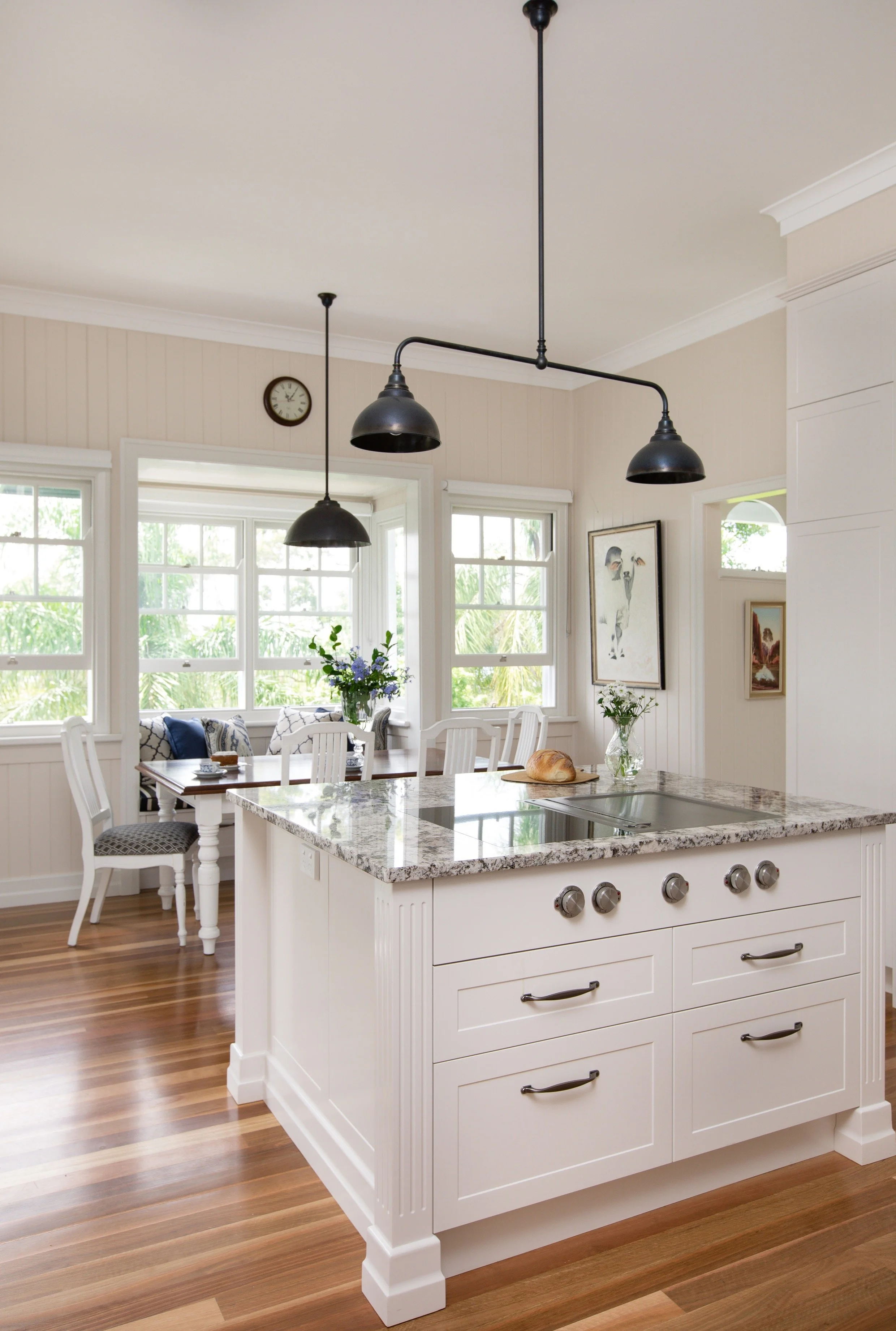
Global colour trends, translated into soft whites and neutrals in a real kitchen | Inside Out Colour & Design
Meet Cloud Dancer: not your average white
Pantone describes Cloud Dancer as a lofty, billowy white with a soft, serene character. It is not a cold blue white, and it is not a creamy yellow white either. Think unbleached clouds, soft light through sheer curtains and freshly laundered cotton rather than high gloss gallery walls.
A few key things to know about Cloud Dancer:
It has a hint of warmth and a whisper of grey, which stops it feeling stark.
It sits comfortably between warm and cool, so it plays well with both.
It continues Pantone’s recent run of comforting, cocooning colours like Peach Fuzz (2024) and Mocha Mousse (2025), which were all about softness, tactility and comfort.
In decorating terms, that makes Cloud Dancer incredibly flexible. It is the kind of white that can happily sit behind bolder colours and let them shine, or take centre stage if you love a more minimal, tonal look.
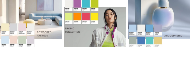
Cloud Dancer anchoring Pantone’s soft, trend-led palettes | Pantone
Why Cloud Dancer is so contentious
You may have already seen the headlines. This is one of Pantone’s most argued about Colour of the Year announcements yet.
There are a few reasons.
First, people often expect the Colour of the Year to be a big statement. A rich teal, a bright coral, a punchy red. Against that expectation, a very soft white can feel like a let down, and some designers and journalists have called Cloud Dancer boring, safe or creatively uninspired.
Second, this is the first time Pantone has chosen a white since they started naming a Colour of the Year. In a world already full of “all white everything” in design and social media, many felt that leaning into another white was a step too far into minimalism.
Third, there is a more serious conversation happening about the cultural optics of elevating “white” in a tense political moment. Some critics have argued that it feels tone deaf, and that choosing a white shade can be read as a rejection of diversity or vibrancy in favour of bland uniformity. Others see it as a deliberate attempt to stir conversation and keep the Pantone announcement in the headlines.
Pantone, for their part, have framed Cloud Dancer as a symbol of calm, clarity and fresh starts, and have emphasised that it is intended as a metaphorical blank canvas rather than a political statement.
As with all colour, context matters. Out in the world, all of these debates are important. Inside your home, though, what most of my Sydney clients really want to know is much simpler.
Will this colour actually be beautiful to live with?
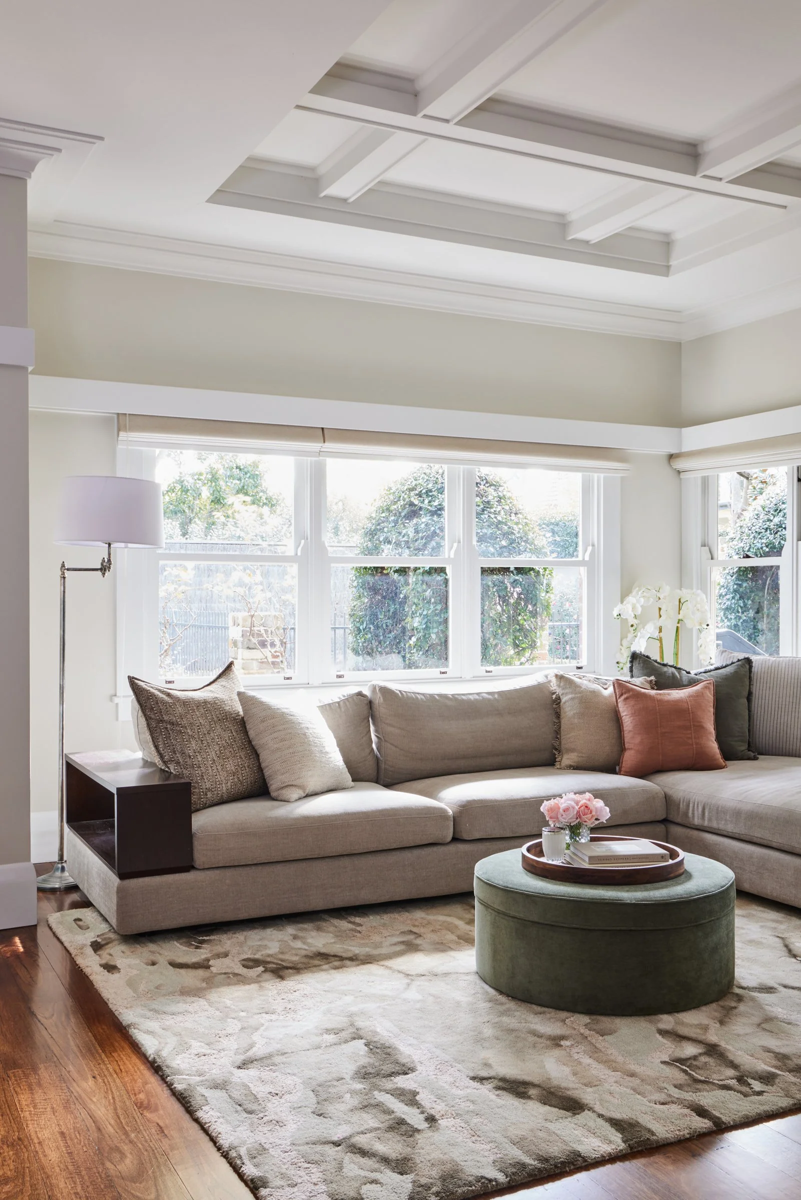
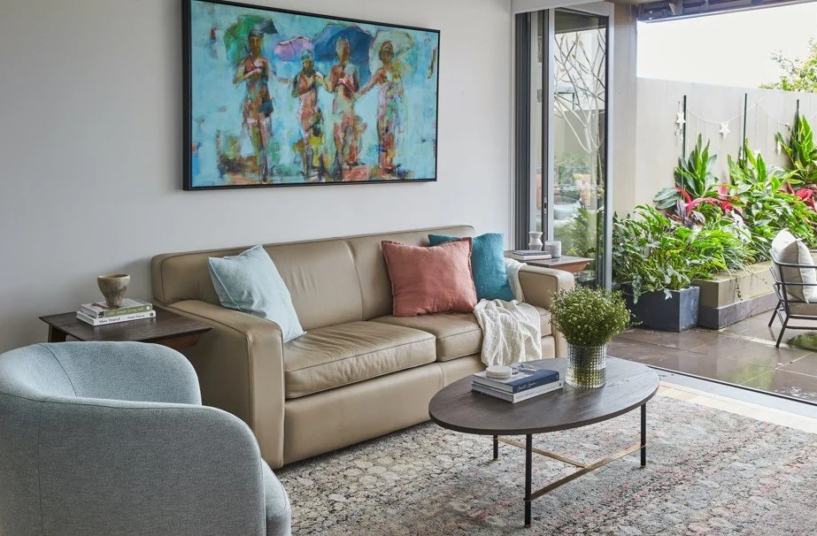
A calm, layered room showing how a “controversial” soft white can still feel warm and welcoming | Inside Out Colour & Design
Why Cloud Dancer is good news for decorating
The short answer is yes, it can be. Used thoughtfully, Cloud Dancer is a very practical, liveable choice, especially in our bright Australian light.
1. It is a gentle white for sunny climates
In Sydney, we receive strong, often harsh light for much of the year. Stark cool whites can feel icy and unforgiving, while very creamy whites can look yellow and dull by mid afternoon.
A soft, slightly warm, slightly greyed white like Cloud Dancer helps to:
bounce light around a room without glare
soften the edges of a space
sit comfortably with both warm timber floors and cooler stone benchtops
It is the sort of neutral that lets your view, artwork and furniture take the lead rather than competing with them.
2. It is incredibly easy to pair with other colours
Because Cloud Dancer is so balanced, it is a brilliant team player. It works with:
earthy neutrals such as mocha, caramel and clay for a warm, cocooning palette
blue greens and teals for a coastal or contemporary look
charcoal, ink and soft black for crisp contrast without the drama of pure black
soft pastels like blush, eucalyptus and duck egg blue for a gentle, layered scheme
You can think of it as the canvas that pulls a whole room together rather than a star colour that dominates.
3. It suits many Australian home styles
Another strength of Cloud Dancer is that it translates across lots of different architecture.
In a coastal apartment in Coogee or Cronulla, a Cloud Dancer style white on the walls with sandy-toned upholstery, pale oak furniture and sea glass blues feels relaxed and breezy rather than beach shack literal.
In an inner west Federation semi, you could keep Cloud Dancer to the ceilings, architraves and doors, then use deeper colours on the walls to emphasise the beautiful period details and original floorboards.
In a contemporary family home on the North Shore or in the Hills District, Cloud Dancer works beautifully on kitchen joinery, pantries and internal doors, layered with textured stone, brushed metal hardware and tactile fabrics.
It is also a lovely base for art collections, vintage rugs and treasured pieces that you may already own.
Use Cloud Dancer as a quiet backdrop to let colour, artwork and greenery shine | Inside Out Colour & Design
How to use Pantone’s 2026 colour in your home
If you are tempted to bring a little Cloud Dancer into your own place, a few practical tips.
Test, test, test
Do not choose a white from a phone screen. Ask your painter or designer to colour match a sample that is close to Cloud Dancer and paint it in large swatches on different walls. Look at it in morning, midday and evening light before you commit.Decide what role you want it to play
Cloud Dancer can be the main wall colour, the ceiling and trim, or the “quiet” tone in your curtains, cabinetry or bed linen. You do not have to repaint the whole house to get the look. Even a single repainted room or a new run of joinery can make a big difference.Layer texture and contrast
White on white on white can feel flat. Cloud Dancer comes to life when you add woven jute, linen, boucle, timber, stone and a mix of matt and semi gloss finishes. A few darker elements, like a charcoal frame or deep green cushion, help to anchor the scheme.Use it as a reset, not a rule
I see Cloud Dancer less as “the colour you must use” and more as a gentle nudge toward quieter, more thoughtful interiors. If your rooms are feeling busy or restless, soft whites and calming neutrals can give you breathing space without losing personality.
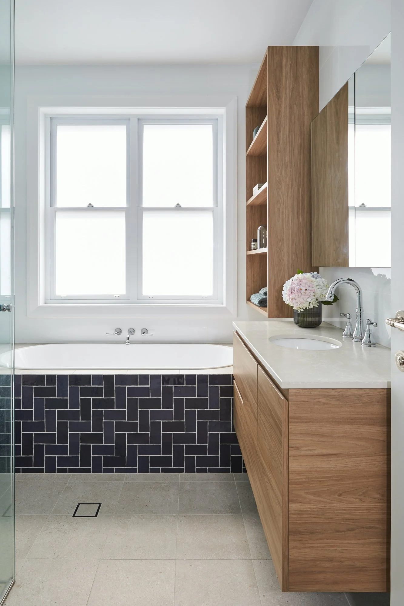
A soft, Cloud Dancer–style white as a fresh backdrop to timber, stone and feature tile | Inside Out Colour & Design
Bringing it back to you and your home
Pantone’s Colour of the Year always sparks big conversations about taste, trends and culture, and Cloud Dancer is no exception. You do not have to love the story behind it to appreciate what it can do in a room.
If you are in Sydney and curious about how a Cloud Dancer style palette might work in your own home, I would love to help you explore it. At Inside Out Colour & Design, we can test the right whites for your light, pair them with colours and materials that suit your architecture, and create a scheme that feels calm, personal and very much “you” rather than just “on trend”. Get in touch and let’s chat!