
The Psychology of Colour: Are you living in the right hue?
Colour is one of the quickest ways to change how a room feels, but it is also one of the hardest things for homeowners to get right. We might fall in love with a paint chip, a cushion or a beautiful image on Instagram, only to find that once the colour is on all four walls it feels completely wrong.
In my last blog post, I looked at Pantone’s Colour of the Year, Cloud Dancer – a calm, billowy white that works beautifully as a soft backdrop in many Australian homes. That post was all about trends and how a single colour can quietly influence fabrics, finishes and styling for years to come.
This time, I want to come closer to home and ask a more personal question:
Are you actually living in the right hue for you?
Because while trends can be helpful, the psychology of colour – how different colours affect our mood and behaviour – is what really determines whether your home feels comfortable, uplifting and “right”.
Why colour psychology matters in your home
Colour psychology is not about strict rules or diagnosing your personality from your paint chart. It is about recognising that different colours tend to evoke different emotional responses.
In a city like Sydney, where we juggle busy lives, traffic, work and family, the way your home feels when you walk through the door really matters. The colours around you can:
help you unwind after a long day
make mornings feel brighter and easier
support focus if you work or study from home
encourage better rest in bedrooms
Get the colour balance wrong and you might find yourself feeling restless, flat or irritated in your own home without really knowing why.
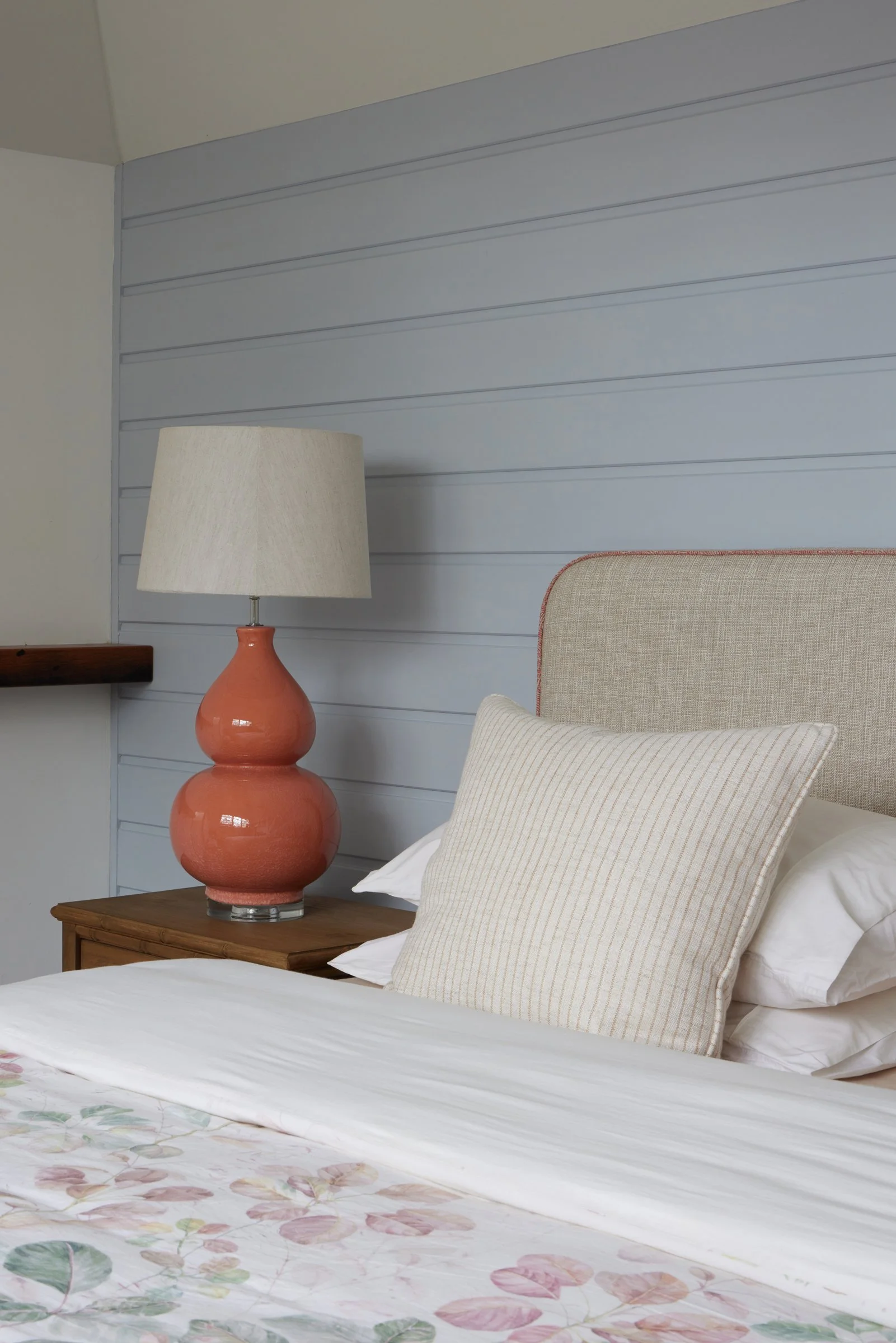
Soft blue walls and warm coral accents creating a calm, uplifting bedroom mood | Inside Out Colour & Design
Warm vs cool: what are you drawn to?
One of the first questions I ask clients is very simple:
“Do you instinctively prefer warm colours or cool colours?”
Warm colours include soft creams, taupes, terracotta, warm greens, mustard, coral and rich timber tones. They often feel inviting, cosy and social.
Cool colours include greys, blue-based whites, blues, blue-greens and some charcoals. They can feel calm, fresh and spacious.
Neither is right or wrong. In our Sydney light, though, cool colours can sometimes feel a bit chilly in south-facing or shaded rooms, while very warm schemes can feel heavy in small spaces.
This is where a colour like Cloud Dancer, which sits gently between warm and cool, becomes useful. It showed in the Pantone article as a flexible base that many people can live with comfortably. But that does not mean everyone should live in a white box. The supporting colours you add on top of that base are what personalise the psychology of your home.
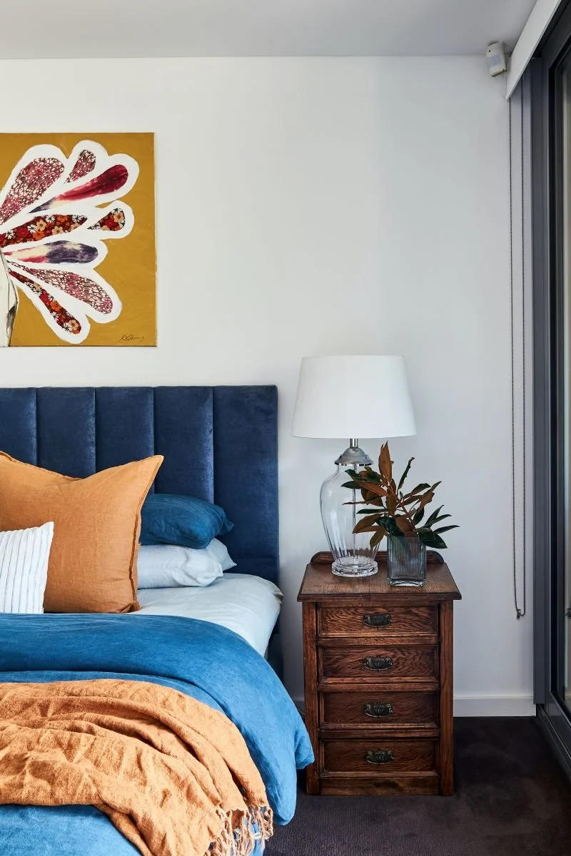
Warm ochres and cool blues working together in a balanced bedroom palette | Inside Out Colour & Design
How different colours can make you feel
Here is a quick guide to how some common interior colours tend to behave psychologically. Remember, context matters – the depth of the colour, the amount of natural light and the surface it is on will all influence the final effect.
Blues and blue-greens
Blues are often associated with calm, clarity and reliability. Soft blue-greens can feel fresh and restorative, which is why we see them so often in coastal and bathroom schemes.
In Sydney, blue-greens work beautifully in living rooms and bedrooms that get good light, especially when teamed with warm timber and textured fabrics so they do not feel cold.
Good for: overthinkers who need a sense of calm, people who love the ocean, and spaces where you want to switch off.
Greens
Green is strongly linked to nature, balance and growth. It is one of the most restful colours for our eyes.
Softer sages and eucalyptus tones are wonderful in bedrooms, studies and open-plan living because they feel grounded without being overwhelming. Deeper olives and bottle greens can be very sophisticated in dining rooms or powder rooms when balanced with light neutrals.
Good for: anyone who wants a more nurturing, grounded atmosphere at home.
Neutrals and whites
Neutrals were the quiet star of the Pantone Cloud Dancer article and with good reason. Soft whites, oatmeals, stone and mushroom tones create clarity and breathing space.
Psychologically, they help small spaces feel larger, give busy minds a visual rest and let collections, artwork and timber floors shine.
However, too much stark white can feel clinical or unfinished, and too many greys can feel flat or gloomy. The trick is to choose the right white or neutral for your light, and then layer it with texture, timber and accent colours so the room still has personality.
Good for: people who crave calm, flexibility and a sense of lightness, but still want to introduce colour through art, textiles and furniture.
Pinks, corals and terracottas
These warmer colours can feel friendly, joyful and comforting in the right dose. Soft blush, peach or clay tones work beautifully in bedrooms, living rooms and entry halls where you want people to feel welcome.
Very strong reds can be energising, but they can also be overstimulating if you are sensitive to visual noise, so I tend to keep them to artwork and accessories rather than all four walls.
Good for: social households, entertainers and anyone who wants warmth and a bit of fun.
Charcoal and deep tones
Deep charcoals, inky blues and even very dark greens can make stunning, cocooning spaces. Psychologically they can feel safe, intimate and grounding – like putting a cosy blanket around the room.
In Sydney homes, I often use these deeper hues in media rooms, snug sitting rooms, powder rooms or bedrooms with good natural light. The key is balancing them with plenty of lighter elements: pale flooring, lighter bed linen, metallic accents or crisp white trims.
Good for: people who like drama and depth, and who are not afraid of colour.
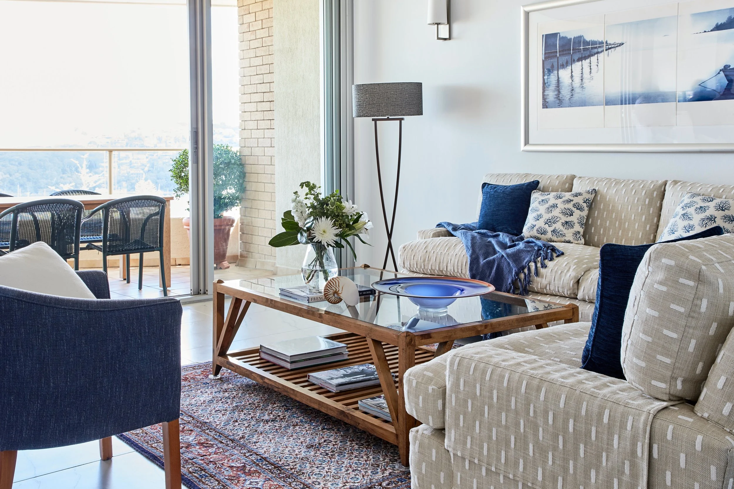
Cool blues and soft neutrals creating a calm, coastal-inspired living space | Inside Out Colour & Design
Are you living in the right hue?
If you are not sure whether your current colours are working for you, try asking yourself a few questions:
Do I feel more relaxed or more restless in this room?
Does this colour support what I do here – sleeping, working, entertaining, cooking?
Is there a mismatch between the mood I want and the mood the room actually has?
Do I keep buying accessories to “fix” a room, but it never feels right?
Sometimes the answer is as simple as the wrong undertone – a too-cool white in a shaded room, a heavy beige in a small space, or a bright colour that looked fabulous in a showroom but is overwhelming at home.
Other times, the issue is that the psychology of the palette does not match your personality. For example, very energetic people sometimes choose very bold colours because they love them in theory, but discover that at home they actually need a calmer base and small pops of intensity instead.
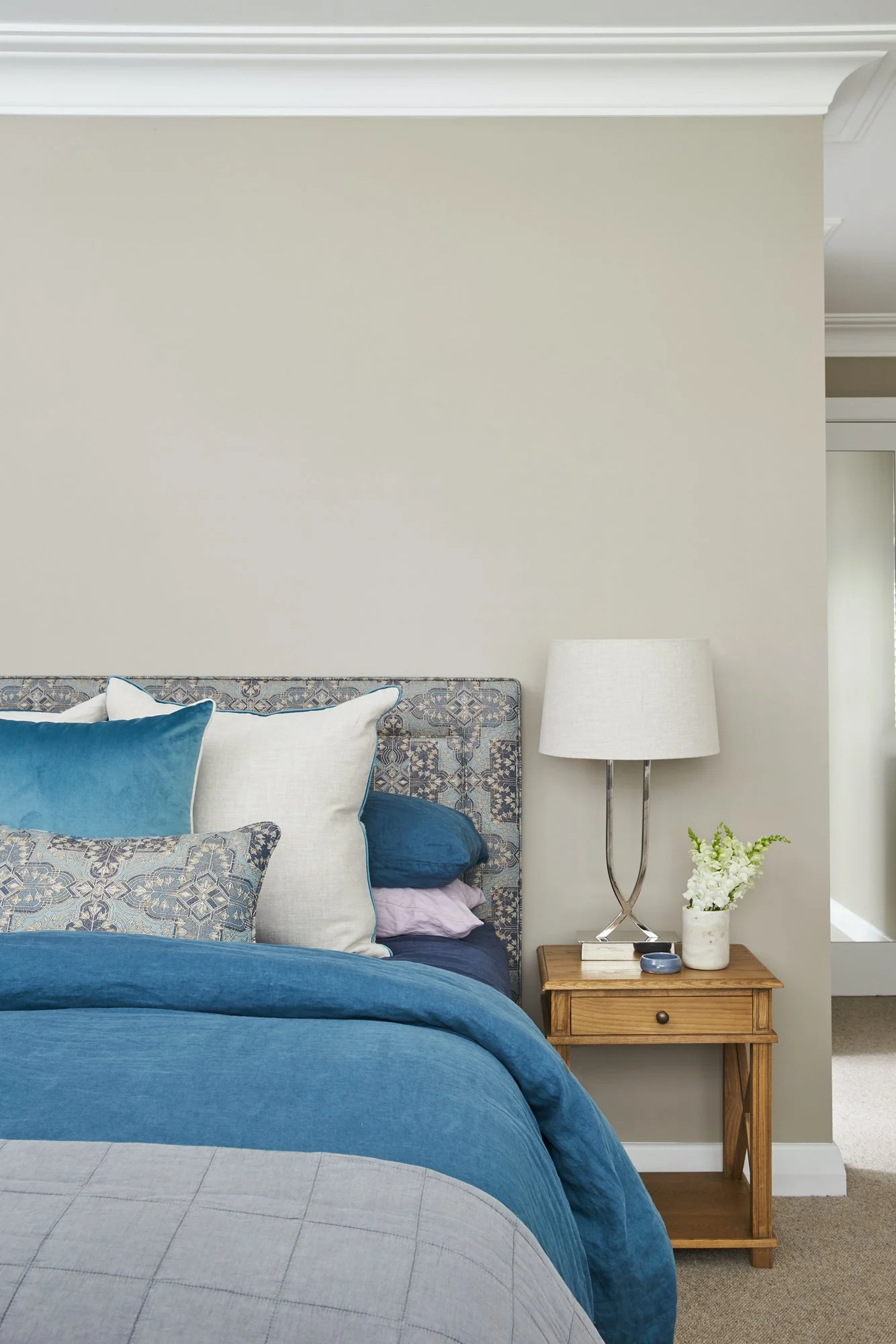
A calm, balanced palette that shows how the right undertones can make a bedroom truly restful | Inside Out Colour & Design
Trends vs you: finding the balance
So where does this leave things like Pantone’s Colour of the Year?
I see trend colours as useful starting points, not instructions. Cloud Dancer is a great example: a soft, liveable white that works for many Australian homes and supports the gentle, comforting direction we are seeing in design. But it only becomes successful when it is combined with the right accent colours for you and tuned to your architecture and light.
Colour psychology is about that finer tuning – taking inspiration from trends, then editing and adapting them so your home supports the way you actually live.
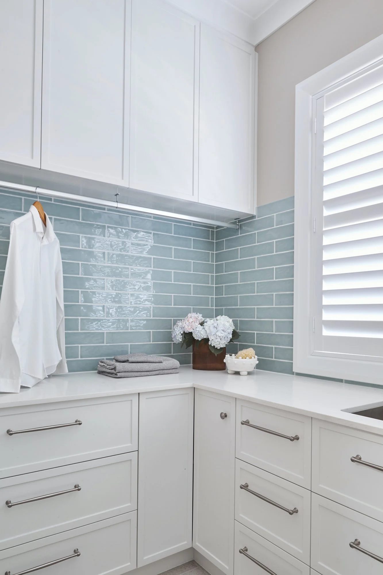
Soft whites and watery blue tiles showing how trend colours can be tailored to suit your home | Inside Out Colour & Design
Need help decoding your colours?
If you are looking around your home and wondering whether you are really living in the right hue, you do not have to figure it out alone. As a Sydney interior designer, I work with clients every week to read their rooms, understand their personalities and create colour schemes that feel both beautiful and deeply comfortable.