
Pinterest vs Real Life: Why your inspiration isn’t translating at home
If you have a folder full of saved interiors and you still feel stuck, you’re not alone. I work with plenty of clients who can show me exactly what they love on Pinterest or Instagram, but when they try to apply it at home, it falls flat. The room ends up looking like a collection of nice things rather than a cohesive space.
This is the gap between Pinterest and real life. And it has nothing to do with your taste.
One of the most helpful things I can do for my design clients is translate inspiration into a design direction that actually suits your home. Here’s why your saved images often don’t work as a copy-and-paste plan, and what a designer does differently.
1) Your home’s architecture is not the same as the photo
This is the biggest reason inspiration doesn’t translate. A beautiful image online might be a New York apartment with high ceilings, oversized windows, and classic detailing. Or a European home with thick walls and softer natural light. Or a brand-new build designed around a specific aesthetic from day one.
Your home in Sydney might be a terrace, a Federation house, a 1980s brick home, a coastal apartment, or a new build with very different proportions. The same styling choices will not land the same way if the bones of the home are different.
This is where design becomes about compatibility. A designer looks at your home’s architecture and asks: what elements of that inspiration fit the bones you have, and what needs to be adjusted so it feels natural?
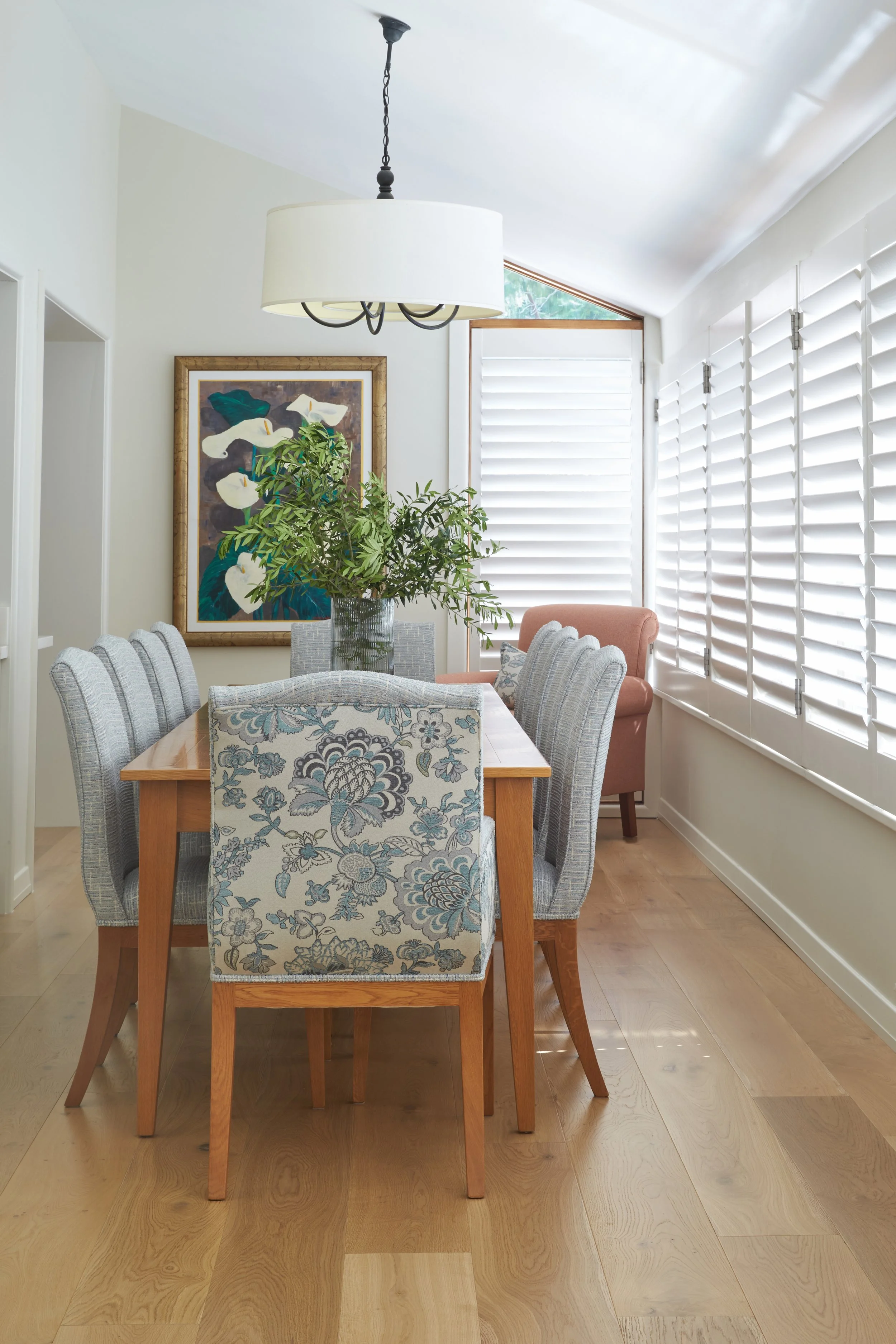
The best results come from translating the mood to suit your home’s proportions, light and era, not copying the look item for item | Inside Out Colour & Design
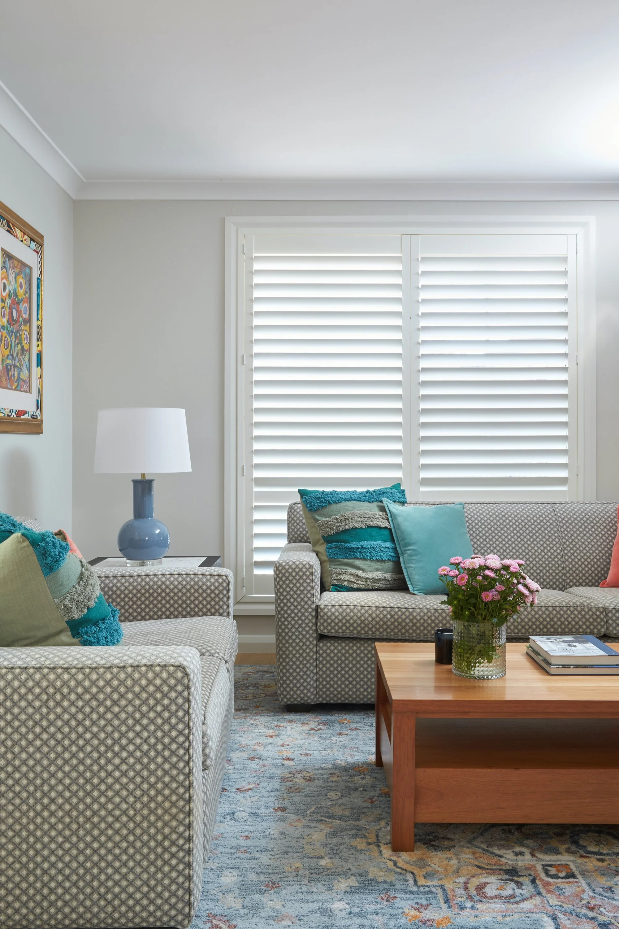
2) Light changes everything, especially in Australian homes
Sydney light is bright. It can wash colours out, sharpen contrast, and make undertones far more obvious than you expect. A “soft warm white” you loved online may look stark in a sunlit room. A moody charcoal that looked perfect in a softly lit photo can feel heavy and flat in your space.
Photography is also doing a lot of heavy lifting in inspiration images. Interiors online are shot in ideal conditions with edited colour balance. That doesn’t make them fake, but it does mean they’re not a reliable guide for paint and finish selection.
When I design a room, I’m always designing for your actual orientation, your window sizes, and how the light moves through the space across the day. That’s the difference between choosing a colour that looks good on a screen, and choosing a colour that works in your home.
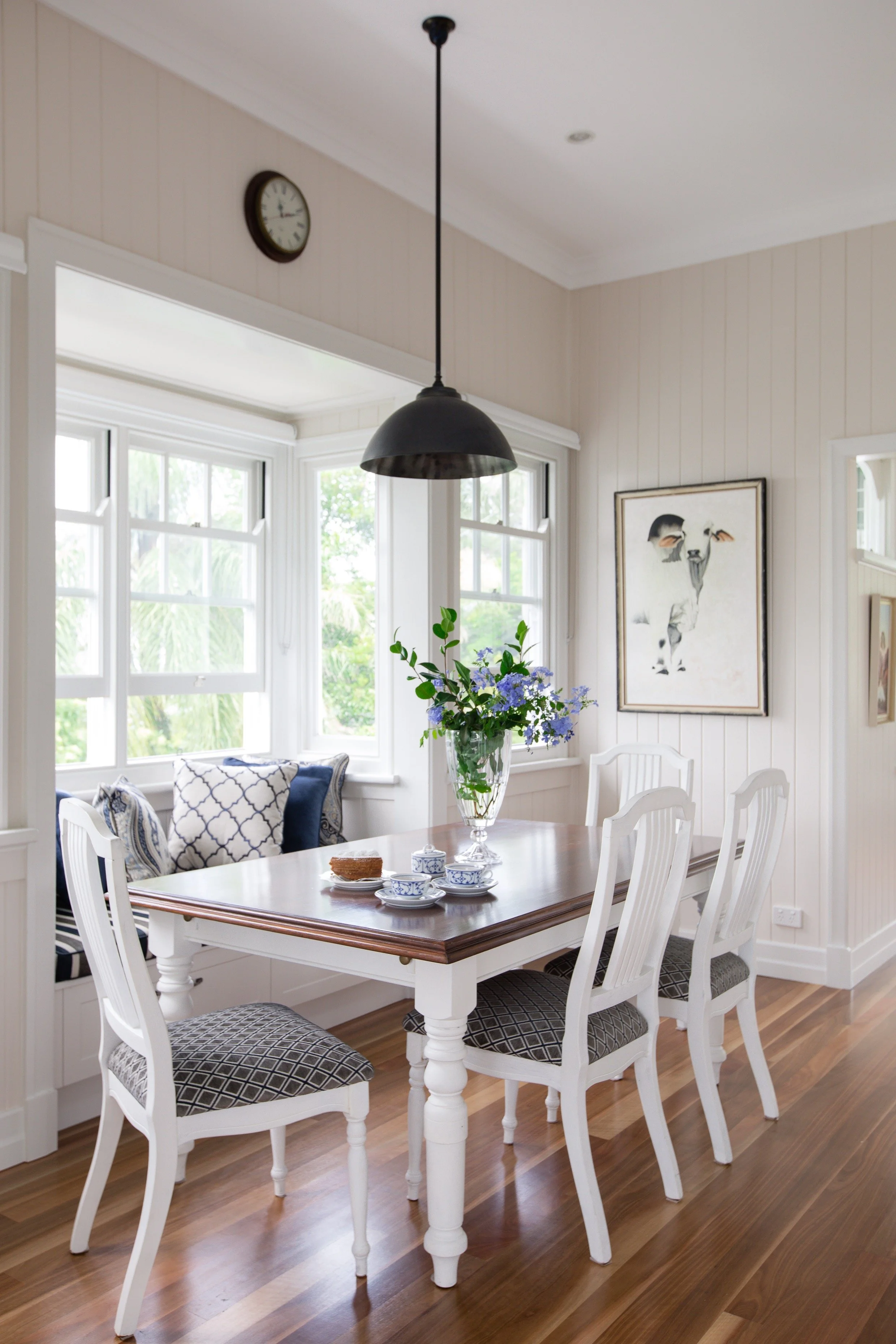
Sydney’s brightness can completely change colour and contrast, so the goal is choosing finishes that work in your home all day, not just on a screen | Inside Out Colour & Design
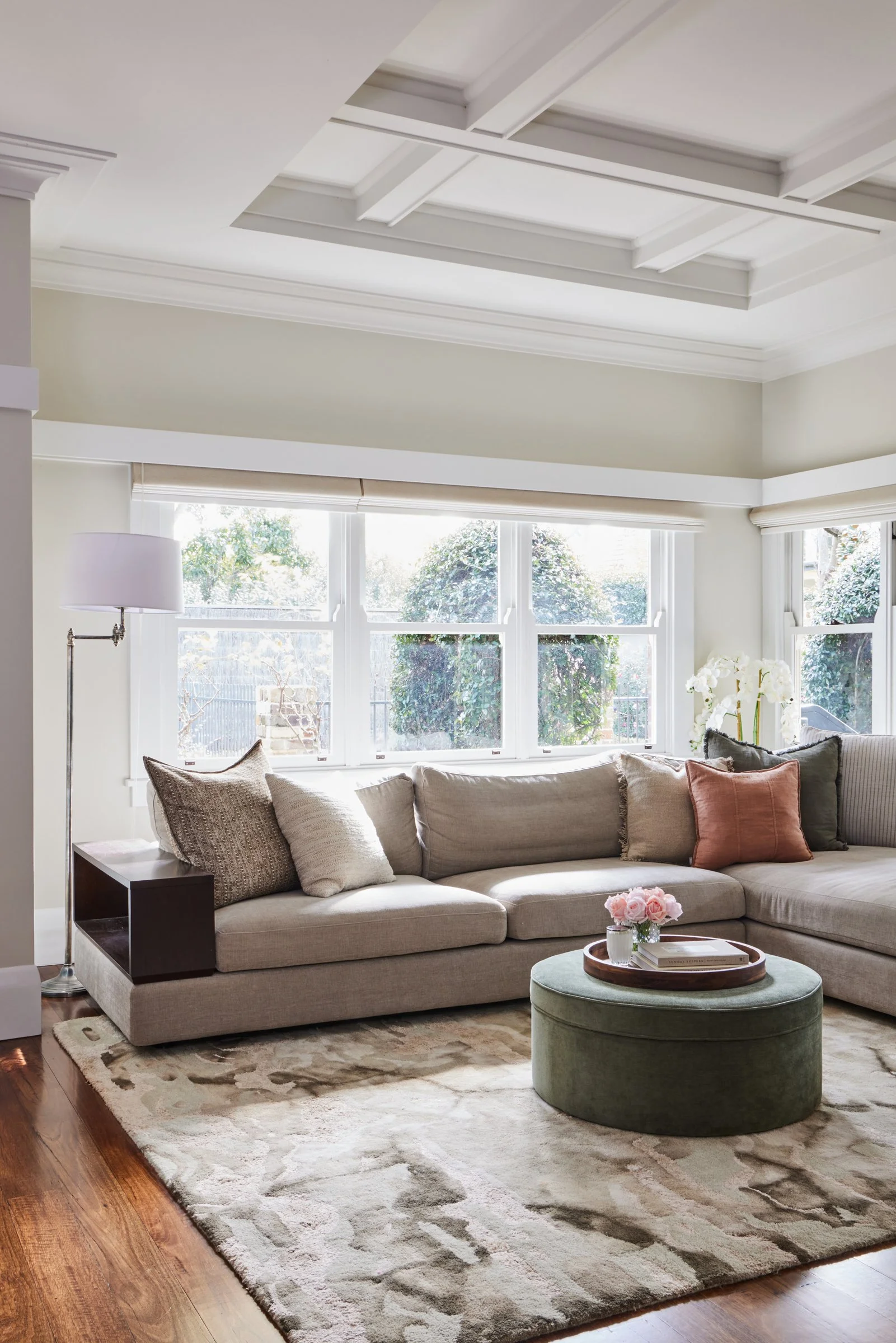
3) Scale and proportion are often the hidden issue
Many Pinterest rooms look “expensive” because the proportions are right. The sofa is the correct scale. The rug is large enough. The coffee table sits at the right height. The pendant light is generous. The artwork is properly sized.
In real homes, the same look falls apart when the scale is off. A rug that’s too small makes a room feel mean and unfinished. Tiny artwork on a large wall can feel lost. A sofa that’s too bulky can swallow the space. Dining chairs with heavy visual weight can make a room feel crowded.
Most people don’t have a scale problem because they lack taste. They have a scale problem because it’s hard to judge these relationships until everything is in the room. A designer anticipates it before you buy.
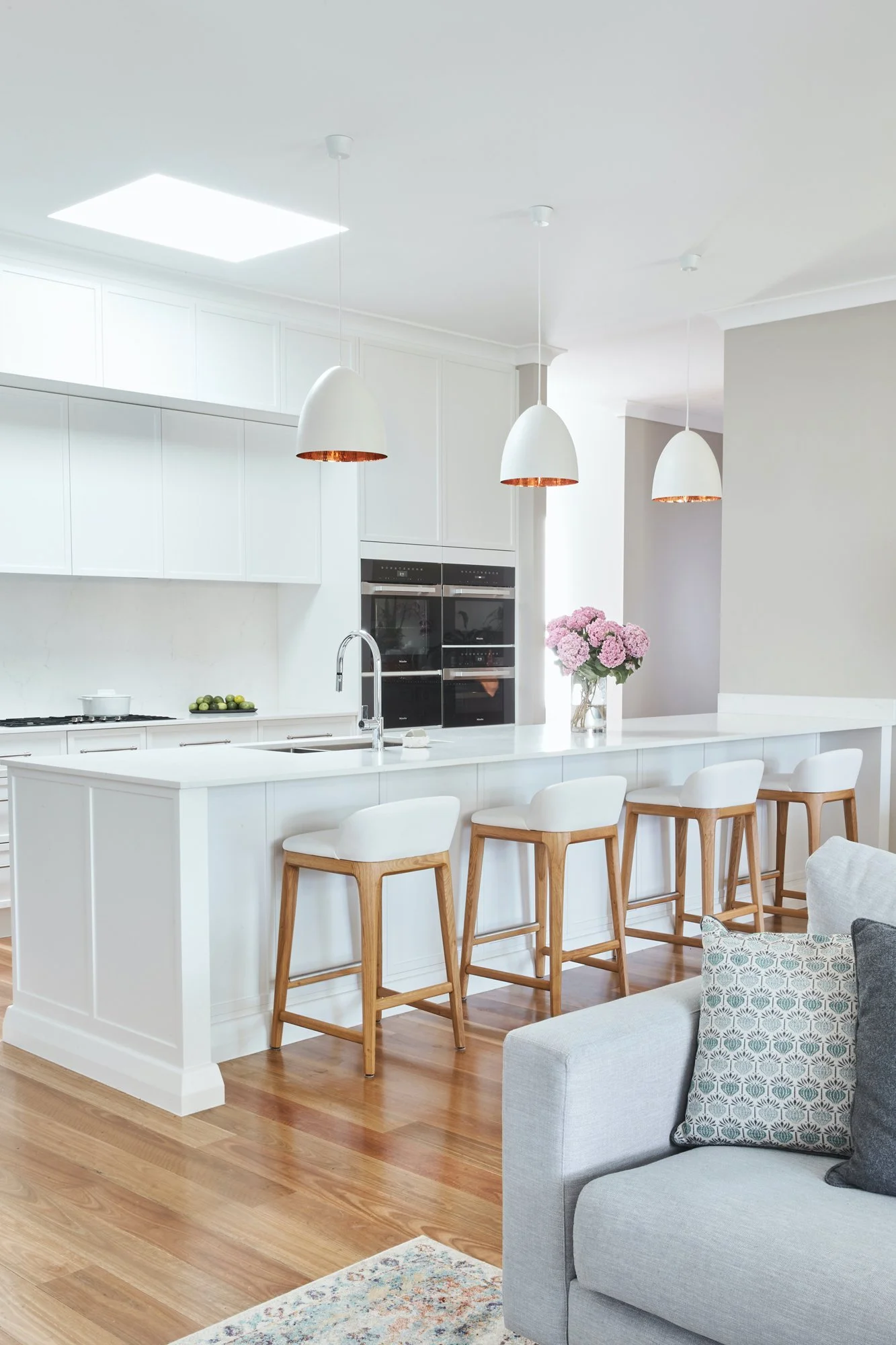
When the proportions are right, everything looks considered (even in all-white) | Inside Out Colour & Design
4) Your budget needs a strategy, not a wish list
Another reason inspiration doesn’t translate is that the photo you love might represent a very different budget. The joinery might be custom. The materials might be high-end. The furniture might be designer. The styling might be layered with pieces collected over years.
That doesn’t mean you can’t achieve a similar feeling. It just means you need to approach it strategically.
This is where I help clients prioritise. We decide what actually creates the impact in the room and what can be simpler. Often it’s better to invest in one or two key elements and let the rest support them. A designer’s job is to make the budget work hard, not to push you into buying everything.
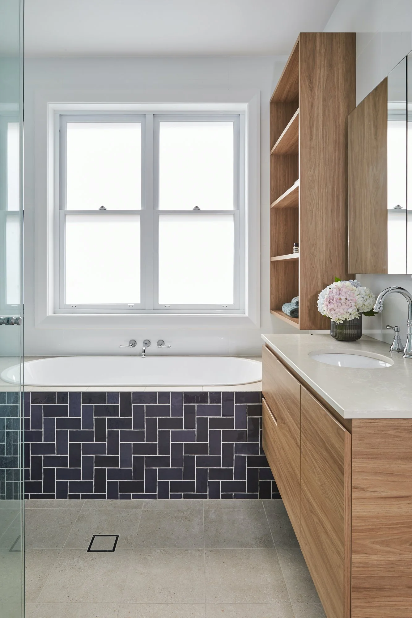
A strategic budget looks like this: one hero element, then calm, hardworking finishes that support it | Inside Out Colour & Design
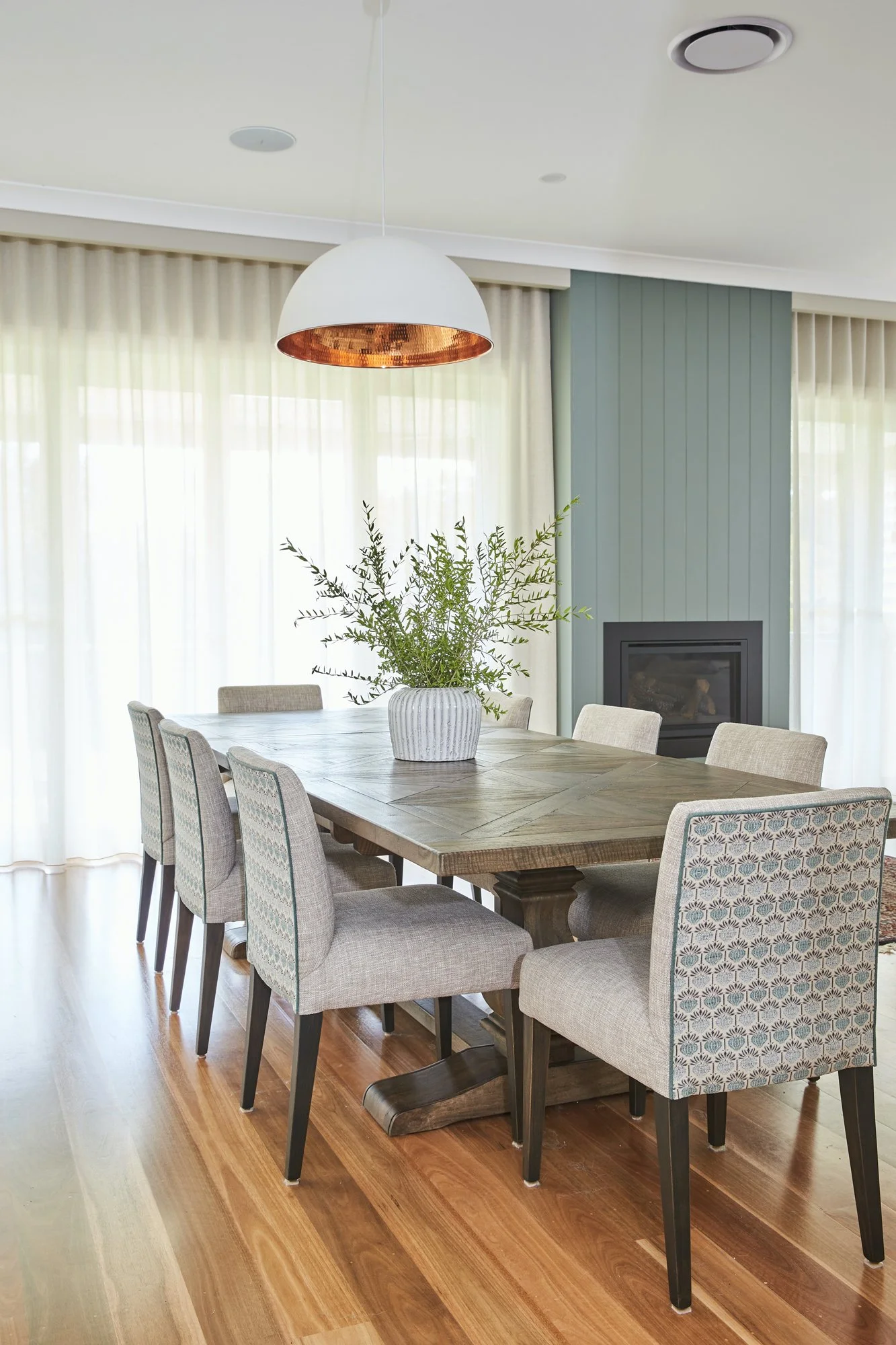
5) The “look” is usually a whole system, not one hero item
People often try to recreate a Pinterest room by buying the hero item first. The sofa, the pendant, the dining table, the tile. Then everything else becomes a scramble to match.
The issue is that the look you’re responding to is almost always created by a system:
a consistent undertone story across floors, walls and joinery
a balanced mix of materials and finishes
a lighting plan that flatters the space
a considered level of contrast
repeated shapes or forms that create cohesion
styling that’s edited, not cluttered
You can buy the same chair that appears in a beautiful photo and still not get the same result if the rest of the system is missing.
When I create a design direction, I’m building that system for your home. That’s what makes the room feel coherent.
The “Pinterest look” isn’t one magic sofa, it’s the whole recipe: layered neutrals, repeated finishes, balanced contrast and lighting that makes everything feel calm, cohesive and intentional | Inside Out Colour & Design
6) Your lifestyle needs to be designed in, not worked around
Pinterest doesn’t show you the school bags, dog toys, work laptop, drying rack, sports gear, and the reality of how a family actually uses a space.
The most successful homes are designed around how people really live. That includes storage, durability, traffic flow, and the daily habits that either support calm or create chaos.
A home can look beautiful and still feel annoying to live in if the layout doesn’t work, the storage isn’t planned, or the materials are too precious.
When I work with clients, we start by getting clear on what the home needs to do. Then we build the aesthetic around that, so it’s not just pretty, it’s practical and enjoyable.
Beautiful homes don’t just look good, they work: when storage, durability and traffic flow are designed in from the start, the room feels calm and effortless in real life, not just in a photo | Inside Out Colour & Design
How I turn saved images into a design direction that works
When a client brings me their Pinterest folder, I’m not looking for a room to copy. I’m looking for patterns. Here’s what I pull out:
recurring colours and undertones you’re drawn to
materials you consistently love (timber, stone, linen, metal)
the level of contrast you prefer (soft and tonal or crisp and high-contrast)
the mood you’re aiming for (calm, warm, polished, relaxed, dramatic)
shapes you respond to (curves, clean lines, classic detailing)
what you dislike as much as what you like
Then I translate that into a clear plan for your home, including:
a cohesive palette that works in your light
furniture choices that suit your scale
finishes that align with your architecture
a lighting approach that supports the mood
a prioritised investment plan for your budget
a final result that feels personal and timeless
That’s how inspiration becomes reality.
From saved images to a real-life plan: I find the patterns in what you love, then translate them into a cohesive direction that suits your home’s light, scale and lifestyle | Inside Out Colour & Design
If you’re stuck, it’s not you. It’s the missing translation
If your saved images aren’t translating at home, it doesn’t mean you have bad taste. It usually means you need a bridge between “what I love” and “what works here”.
If you’re in Sydney and you’re ready to move from endless saving to an actual plan, I can help.
At Inside Out Colour & Design, we turn your inspiration folder into a design direction that actually works, for your architecture, your light, your lifestyle and your budget.
If you’d like to chat about your space, I’d love to help you get clear on the next steps.