
Street Appeal by Design: Why the front of your home needs a plan (not a weekend refresh)
Street appeal is often treated like a quick tidy-up. A bit of paint, a new doormat, maybe a pot plant by the door. And while those things can help, the truth is this: great street appeal rarely happens by accident. The homes that feel quietly “right” from the street almost always have a clear design logic behind them.
Here at our Sydney-based Inside Out Colour & Design, I think of street appeal as the first chapter of your home’s story. It should reflect the architecture, feel welcoming, and hold up year-round, not just look good for a season or a special occasion. It also needs to work in real conditions: harsh summer light, winter greyness, evening shadows, and the way exterior colours behave in the Australian climate.
If you have ever painted a sample and thought, “That is not the colour I expected,” you already know why a plan matters.
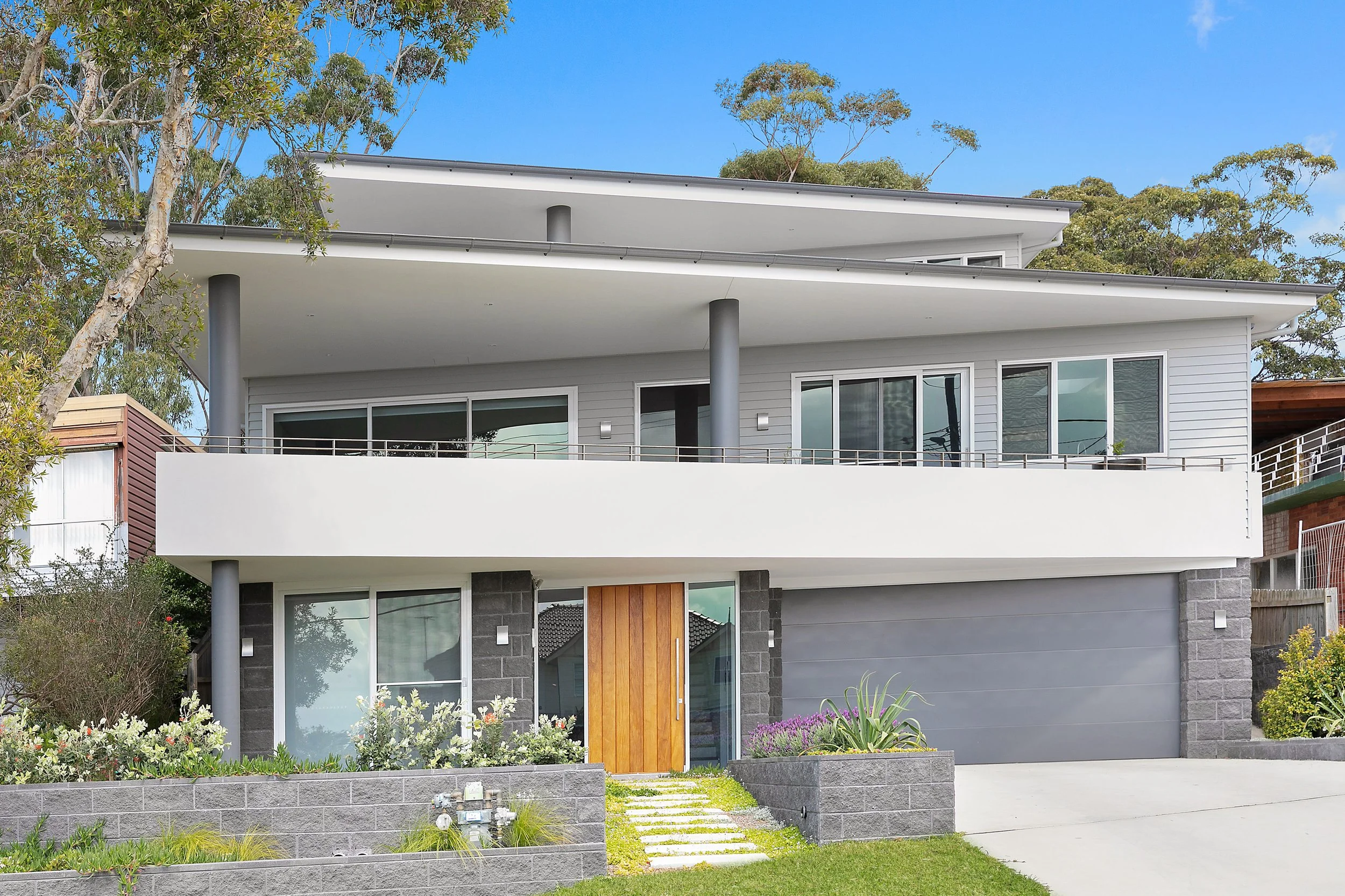
Street appeal by design: a cohesive palette and an entry that feels welcoming year round | Inside Out Colour & Design
Street appeal is a system, not a single decision
The most common reason exteriors feel “unfinished” is that decisions are made in isolation. A front door colour is chosen without considering roof tone. A trim white clashes with existing brick. The lighting is selected late, and suddenly the entry feels cold at night. A verandah setting looks great online but doesn’t suit the scale of the porch.
Street appeal works best when it’s treated as a connected set of decisions. The key elements include:
architecture and proportions
fixed materials (roof, brick, stone, driveway, windows)
exterior paint palette
entry clarity and wayfinding
lighting and night-time feel
verandah and front-of-house styling
hardware and details (numbers, door furniture, letterbox)
planting structure and boundaries
When these pieces are designed together, the front of the home feels cohesive and intentional.
Street appeal as a system: colour, lighting, entry details and planting working together for a finished welcome | Inside Out Colour & Design
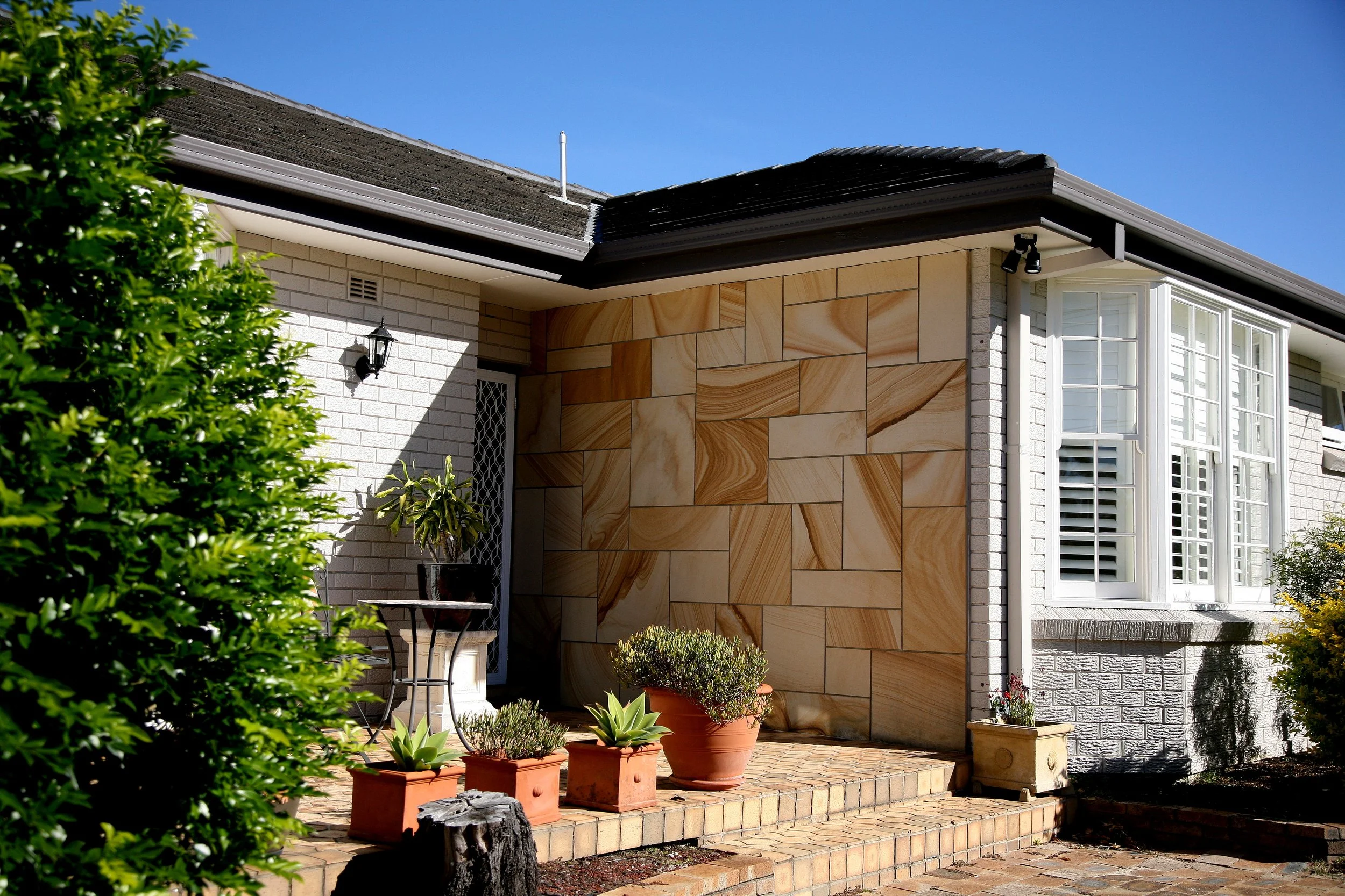
Exterior colour selection is harder than most people expect
Interior colour is one thing. Exterior colour is another world entirely. Outside, paint is affected by:
sun exposure and glare (Sydney light can wash colour out or make it read brighter)
shadow lines from eaves, trees, verandahs and neighbouring buildings
reflected colour from greenery, red brick, sandstone, paving, and even the sky
scale (colours often look stronger on a whole facade than on a small swatch)
material context (a “perfect” white can look completely wrong next to your roof or brick)
This is why street appeal should be approached with expert eyes. You are not choosing “a colour”. You are choosing how the whole home reads, in changing light, across a large surface area, against fixed materials you cannot ignore.
Exterior colour is never “just paint”: light, shadows and fixed materials change everything from the street | Inside Out Colour & Design
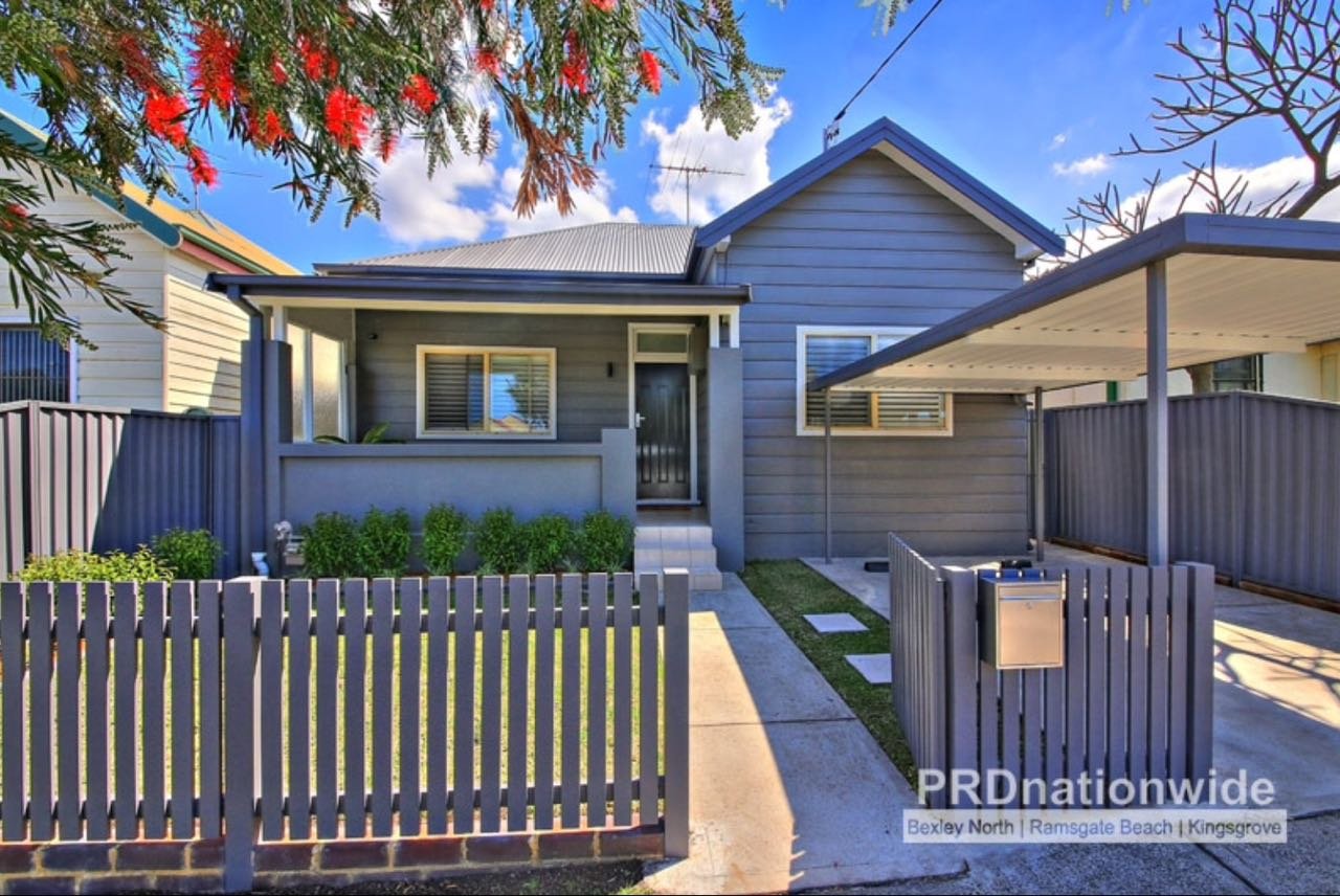
The palette approach that prevents expensive mistakes
A strong exterior scheme usually works as a structured palette, not a single hero colour. I often build an exterior around four roles:
Fixed elements: roof, brick, stone, driveway, windows, gutters
Body colour: the main facade and the overall mood
Trim colour: the frame that sharpens and defines architectural detail
Accent colour: usually the front door, sometimes shutters or a feature element
When those roles are clear, the home reads as considered and timeless. When they are not, it can look patchy or “almost right”.
A clear palette does the work: brick, trim and accents working together so the façade feels finished | Inside Out Colour & Design
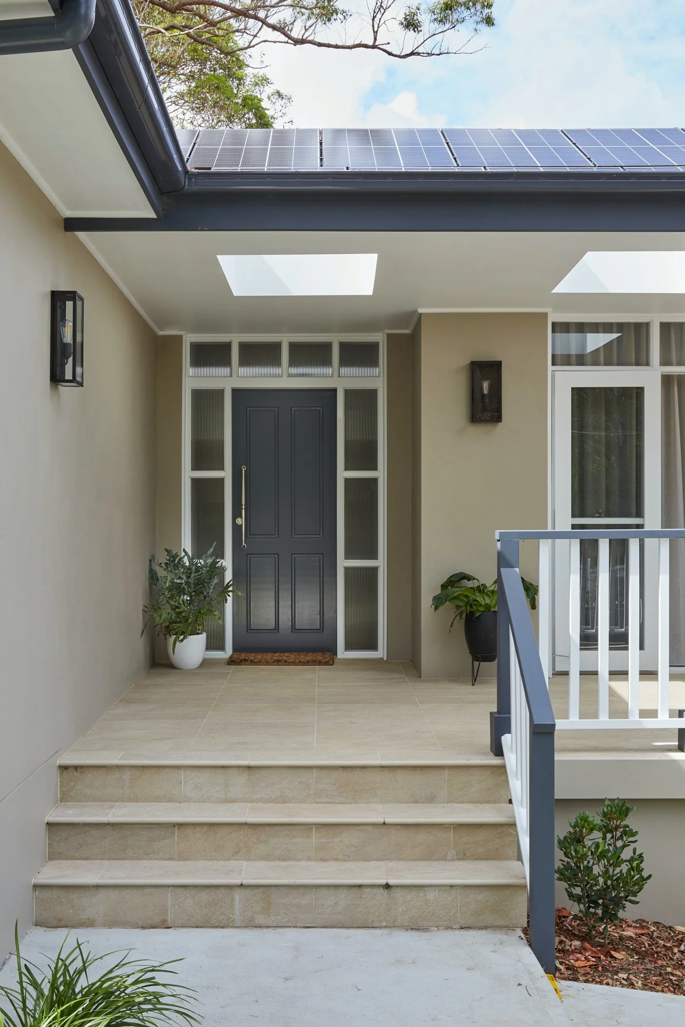
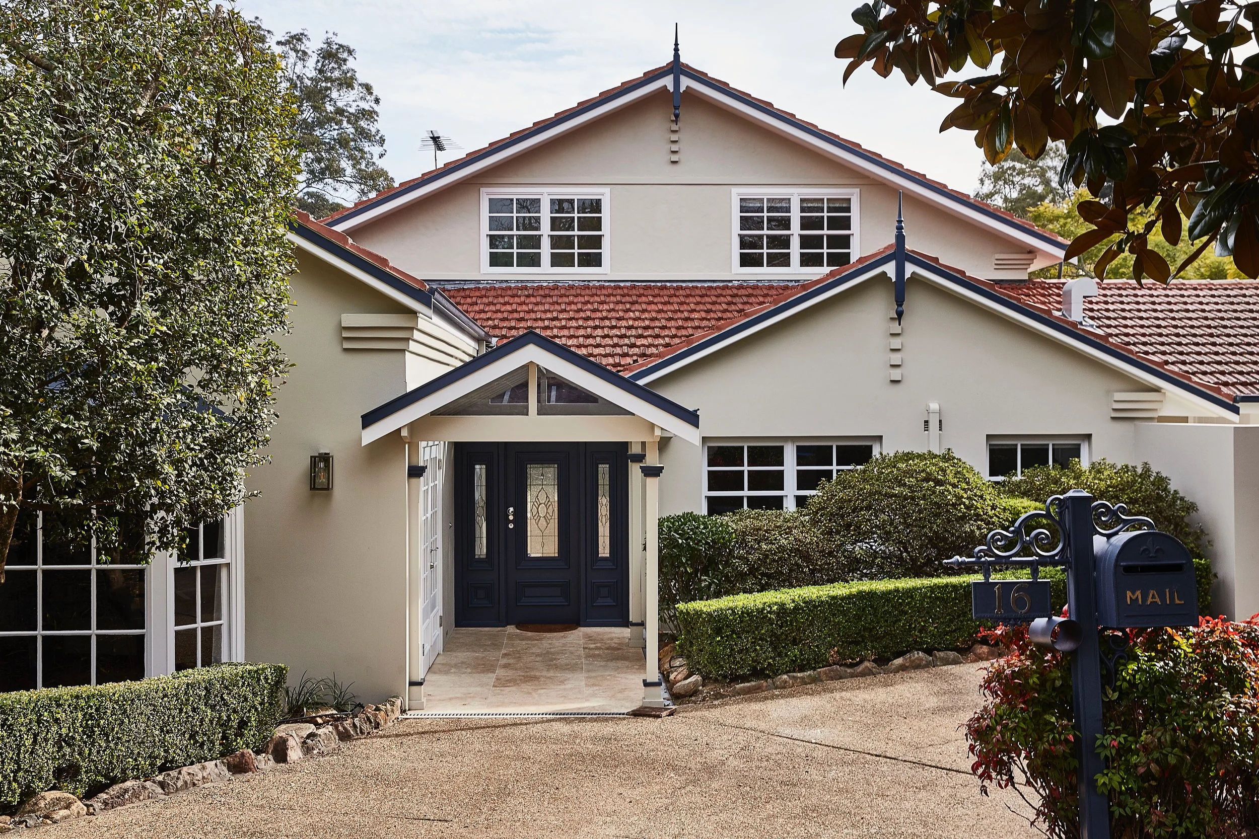
Street appeal is also about the arrival experience
Even the best palette can fall flat if the entry feels unclear. Street appeal is not only what your house looks like, it is how it welcomes people in. I consider:
What draws your eye first from the street
Whether the front door is clearly defined
How visitors intuitively find the entry
What the home feels like after dark
This is where lighting becomes essential. Many homes rely on a single harsh porch light or dated fittings that flatten the facade. A well-planned lighting approach creates warmth, improves safety, and gives the home a beautiful presence at night. It also helps the architecture feel intentional, not forgotten once the sun goes down.
A clear arrival moment: the entry, path and lighting guide you in and give the façade presence day and night | Inside Out Colour & Design
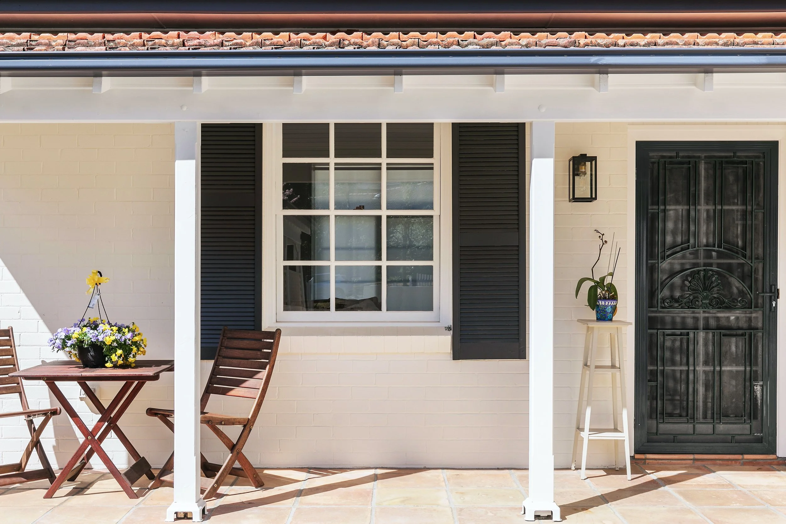
Verandahs and porches need the same design thinking as interiors
Verandah styling is often treated as an afterthought, but it has a big role in street appeal. It sits right at the threshold between public and private, and it signals how the home will feel inside.
A verandah that works well is not “decorated”, it is designed. The decisions need to suit:
the scale of the porch
weather and sun exposure
circulation and door swing
privacy and sightlines
the style and era of the home
For example, a small porch can be overwhelmed by oversized chairs, while a wide verandah can feel empty without anchoring elements. Materials and fabrics matter too. What looks great in a showroom may not cope with Australian UV or coastal air. This is where expert guidance saves you from buying the wrong pieces twice.
The goal is a verandah that feels welcoming and calm, and still looks good in winter, not just in summer.
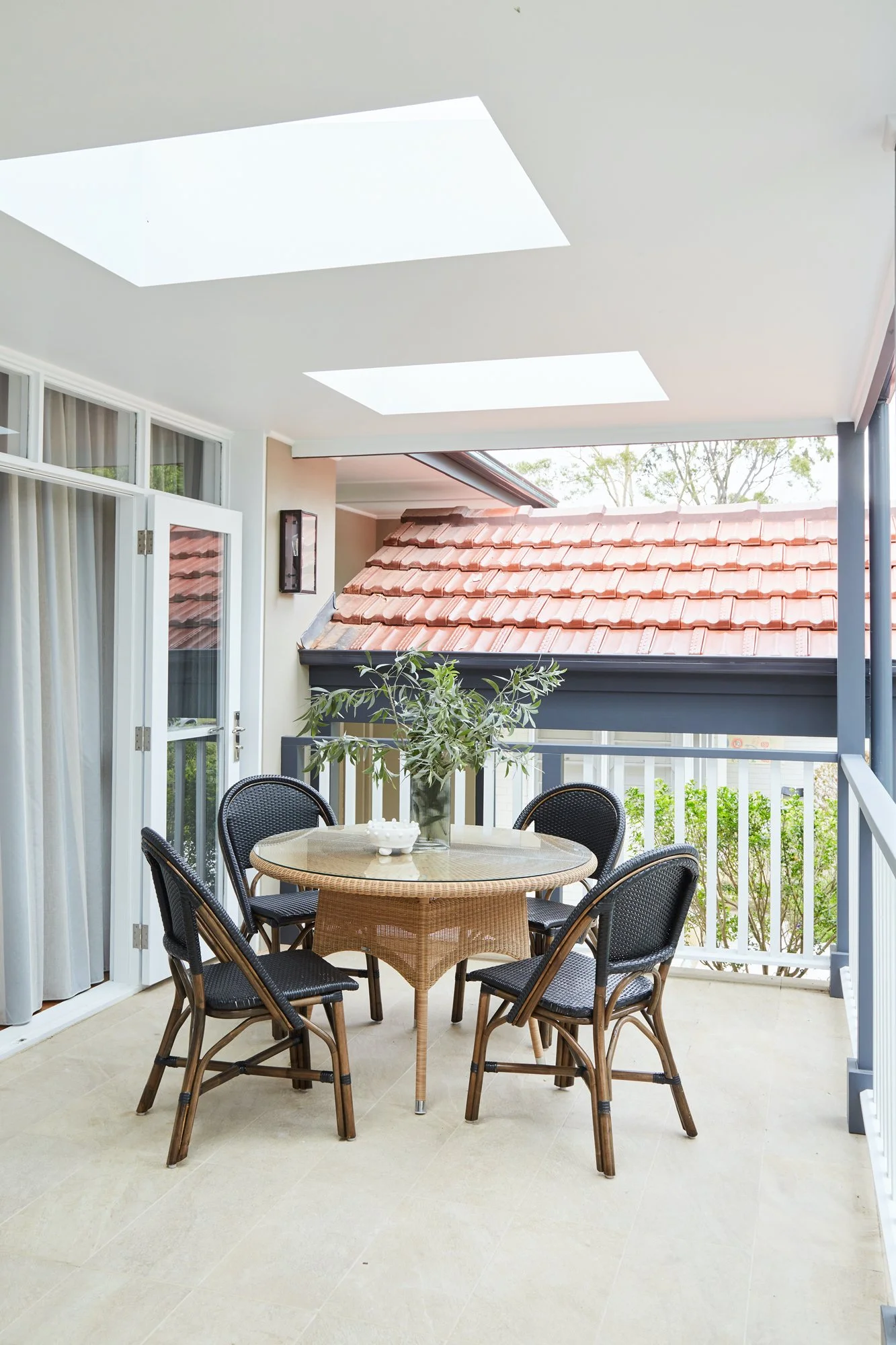
A verandah designed like a room: right-scaled seating, shelter and structure that welcomes you in year round | Inside Out Colour & Design
The finishing details that make a home feel “complete”
Street appeal often hinges on details that are easy to underestimate:
house numbers that suit the architecture and are readable
door hardware that matches the home’s era and the exterior palette
a letterbox that feels intentional, not leftover
consistent window furnishings visible from the street
a clear, confident front door moment
These are the “small” elements that create polish. When they are mismatched, the home can feel unfinished. When they are coordinated, everything looks more elevated, even if nothing was expensive.
The details that finish the façade: considered lighting, hardware, house numbers and a confident front door | Inside Out Colour & Design
Why street appeal is an expert job
Street appeal looks simple from the outside. In reality, it is a coordination exercise. It’s colour theory, proportion, material compatibility, lighting design, and architectural sensitivity, all working together.
This is exactly the kind of work where expert input makes the process easier and the result stronger, because we:
interpret how colours will behave in your specific light and context
work with fixed elements rather than fighting them
create a cohesive palette that suits your home’s architecture
plan key details so the exterior reads as finished
help you avoid costly mistakes and re-dos
ensure the result feels timeless and true to your home, not trend-led
Expert street appeal is coordination: materials, colour and proportions working together so the entry feels intentional and finished | Inside Out Colour & Design
If you’re considering an exterior refresh, bring us in early
If you are planning exterior painting, updating the front entry, or refreshing your verandah, I always recommend bringing a designer in before decisions start being locked in. Exterior choices are high impact and harder to undo later. A clear plan up front saves time, money and second-guessing.
If you’re in Sydney and you want street appeal that feels cohesive, timeless and welcoming year-round, I’d love to help. At Inside Out Colour & Design, we can create an exterior colour and street appeal plan that suits your home’s architecture and the way you want it to feel every time you arrive home. Let’s do this together - contact me today to make a start!